I found a PS/2 adapter in the late 90's and used it on the ATX form factor case, I tend to upgrade computers so this computer with my reliable XP in it has my same keyboard that I used back in 1991. I love that keyboard, it is built like a tank.
This is a recreation of the Microsoft webpage back in 1994, in celebration of 20 years of the website's existence Microsoft made a recreation to put on its regular website.
In 1994, there was no World Series because of a strike by the Major League Baseball Players Association. Nelson Mandela made world news — and history — by becoming president of South Africa. TV shows like “Seinfeld,” “ER” and “Murder, She Wrote” peppered evening viewing fare in the U.S.
“Speed” was one of the more popular movies that year. But speed was not a reality for a very young World Wide Web in 1994, with pokey dial-up modems the norm for getting onto the Web. There were only a few thousand websites then – compared to nearly 1 billion now – and Microsoft was among them. In the 20 years since it has been on the Web, Microsoft.com has remained in the top 10 most-visited websites worldwide.
Twenty years ago, there was no Facebook, of course, no eBay, no Amazon, no Wikipedia. It was Web less-than-1.0.
In 1994, among the reasons Microsoft started a website was to put its growing Knowledge Base online. At the time, the company managed support forums for customers on CompuServe, one of the earliest major Internet dial-up service providers.
“We had started to build up a community there; people would answer questions for each other,” recalls Mark Ingalls, a Microsoft engineer in 1994 who would become Microsoft.com’s first administrator. He was also the only website employee at that time, other than his boss. But the staff doubled early on, when Steve Heaney was hired to offer vacation relief, Ingalls says.
In terms of “Web design,” the notion, much less the phrase, didn’t really exist.
“There wasn’t much for authoring tools,” Ingalls says. “There was this thing called HTML that almost nobody knew.” Information that was submitted for the new Microsoft.com website often came to Ingalls via 3-1/2-inch floppy disks.
“Steve Heaney and I put together PERL scripts that handled a lot of these daily publishing duties for us,” he says. “For a while, we ran the site like a newspaper, where we published content twice a day. And if you missed the cutoff for the publishing deadline, you didn’t get it published until the next running of the presses, or however you want to term it.”
Today, there are a number of individuals who work on Microsoft.com. Chris Balt, Microsoft.com product manager, says the home page has to “support consumer users and enterprise users, home users and developers, teachers, students … If you think about the huge range of audience that comes to our website, it’s a unique challenge.” Plus there are the “stakeholders,” the business groups within Microsoft.
“They all want their spot on the home page that gets 20 million to 30 million visits a month. But my job exists to serve the user and to serve our customers – so first and foremost, the job of the home page is telling people what Microsoft is about; it’s helping them accomplish a task. That could mean fixing a problem. That could be learning about new products. Or that could be learning about old products.”
Microsoft.com was also one of the first corporate sites in the world to be built using modern, “responsive” design, meaning its design adapts to and renders appropriately for any device, Balt says.
“Responsive means it can be accessed on a phone, it can be accessed on a tablet, you can look at it on your Xbox – and it completely adjusts to suit the unique properties of the device that you’re using.”
Trent Walton, Dave Rupert and Reagan Ray of Paravel Inc., in Austin, Texas, did the most recent redesign of Microsoft’s home page, its 17th in 20 years. It is the home page that visitors now see.
To help celebrate the 20th anniversary, Walton and Rupert re-created the 1994 page from scratch, describing it as “sort of like an archaeological dig, digging through dinosaur bones, to find out how they did this then,” says Rupert.
“It seems really simple, but we had to kind of peel back the years and go down to 1994 technology – where your browser doesn’t support images, for example,” he says. “In 1994, it was more of a triumph to have a Web page in and of itself, whether or not an image was attached.”
Walton says Microsoft.com’s responsive design is how more websites will be in the future.
“The idea is that we need to build things more simply so that they work in more places, as well as on more kinds of devices,” he says. “These days it’s not just computers and phones that can access the Internet, but things like cars, glasses, watches. Web design is about building a really solid website that be accessed by as many different types of devices as possible. No one wants to be told where and how to access the site – they want to do it on their terms. If they’re on a phone, they want to do it that way; if they’re on a desktop with a 27-inch monitor, they want to do it that way. So, it’s up to us provide the experiences they want.”
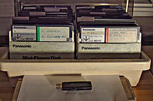
A box of about 80 floppy disks together with one USB memory stick. The
stick is capable of holding over 130 times as much data as the entire
box of disks put together.


Try the days of 300 baud modems... :-) This web page would NEVER load!!! :-D
ReplyDelete